
Chapter 10 Make it fancier

10.1 Extra packages
demoR
countdown
klippy
10.3 include or not?
- tabsets - think about good use cases
- dropdown in tabsets
- code folding
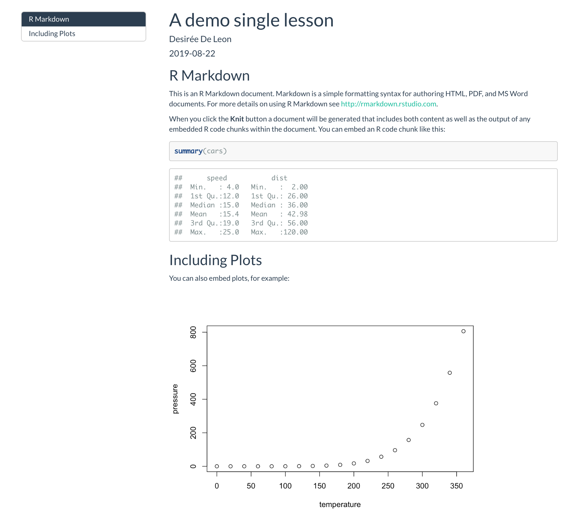
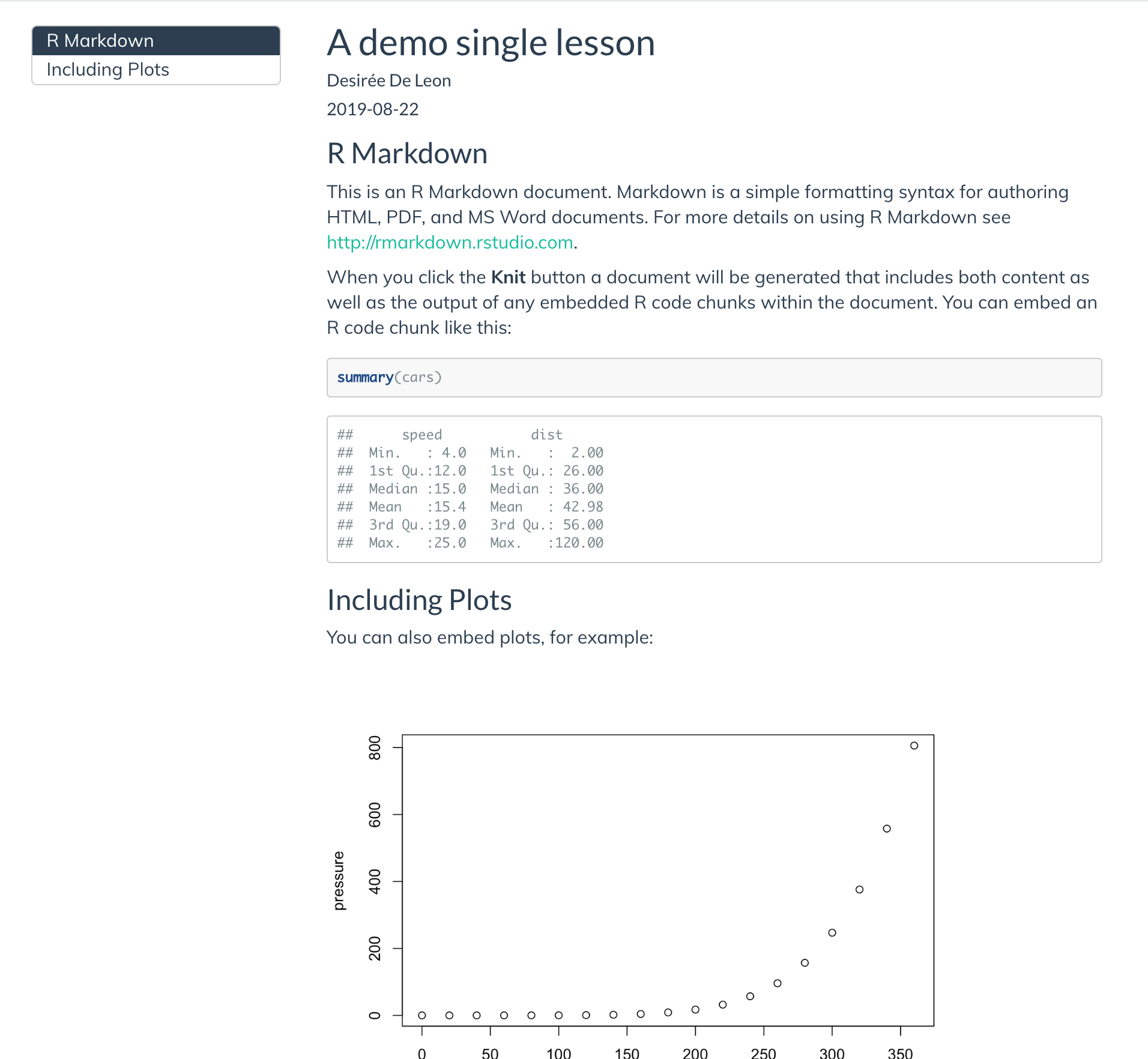
Now it’s time to customize our single lesson even further. We can do a little bit of HTML and CSS work to add-on some fancy features.
10.4 Before you begin
If you’re starting here, I assume that by this point you have already:
Updated your single lesson with your own content in the Make it yours section. (For my demo that follows, I’ll keep going with the boilerplate content since at this point everyone will have different content anyhow).
- At a minimum, added a few elements from the Dress it up section, specifically:
- A theme (I’ve chosen
flatly) - A floating table of contents
- Code highlighting (I chose
tango)
- A theme (I’ve chosen
So that you know where I’m starting, here’s what my YAML frontmatter looks like right now:
If this is your first time having a go at CSS, then you might want to check out the CSS crash course so that you have a sense for how/why we’re doing what we’re doing—otherwise, buckle in for the ride!
10.5 Include a css file
If you want to add any custom styling to your doc, the first thing you’ll need to do is to create a CSS file in your project directory and then tell R Markdown that it exists.
- Go to File > New File > Text File
- Save this file as
style.cssin your project directory. May as well keep this file open because we’re about to add a bunch of stuff to it! - Open the
.Rmdfile you’re working on. In the YAML, reference the new CSS file by adding the
css:option followed by its filepath.Save your changes.
Now you’re all set to start CSS-ing!
10.6 Branding and aesthetics
We’ll start by making changes related to the look and feel of your doc.
10.6.1 Google Fonts
To change the appearance of your text with a new font, you need to:
- Pick a Google font
- Add it to your CSS file
- Style specific text using CSS selectors
- Make sure your CSS file is linked in your YAML (and if you’ve been following along with us, it already is).
10.6.1.1 Select and import your Google font’s script
- Go to https://fonts.google.com/ and pick a font for your lesson’s main body text. We’ll choose
Muli, butLatoandSource Sans Proare other nice options.
We recommend going with sans-serif fonts (i.e. no little feet on the letters) for the main text because they’re easier to read at smaller sizes on screens compared to serif fonts. Don’t pick anything too narrow, too wide, or ornate.)
Select the font you want by clicking on the upper red
+sign, and navigate to the small pop up window.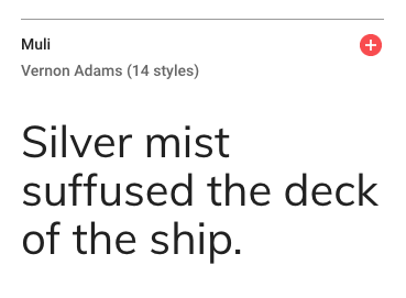
Figure 10.1: Selecting a Google font
Click on the
CUSTOMIZEtab, and select the extra font weights and styles you want. Don’t check any that you don’t think you’ll use (because it slows down your lesson’s loading time ever-so-slightly when you add more). In addition to regular, we’re choosing one italic and one bold.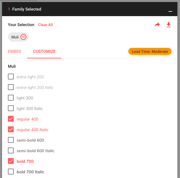
Figure 10.2: Choosing additional font weights and styles
Now click on
EMBEDand look under the@IMPORTtab. Copy the code within the<style>tags (you don’t need the style tags themselves). We will also need the second code chunk in a couple steps that saysSpecify in CSS, so keep this page open to come back to that.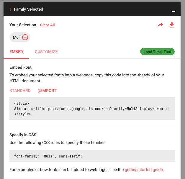
Figure 10.3: Getting the script to import your Google Font
10.6.1.2 Import the font to your lesson
- Back in the RStudio IDE, open up your
style.cssfile. On the very first line, paste in the Google Font import code for the
Mulifont. This makes the font available–but doesn’t actually use it yet.
You might see others import Google fonts by embedding the script (with <script> tags) in an HTML file instead. This is perfectly legitimate. But if you’re just starting out, it’s easier to keep all the font stuff together in a CSS file, which is why we’re doing it this way.
10.6.1.3 Apply the font to your text
We have our font imported, but now we have to be explicit with R Markdown about where to apply it. Let’s create our first CSS style rule below. We will apply the Muli font to our body’s text by using the font-family: property.
- Copy and paste the following style rule to
style.cssbeneath the other line of CSS we’ve already added. Let’s also specify the font size to be
19pxby adding thefont-size:property.Make sure that each line within
{}ends with a;.
Keep tidy! Organize your CSS using comments like /* --insert-comment-- */ to create make-shift section dividers for your CSS, as we’ve done above. We’ll be adding many style rules, and we’ll want some way to keep track of everything as our CSS file grows.
- Time to admire your handiwork and decide whether or not you like it. You can repeat the steps above to apply different fonts to different parts of your lesson. For example, you could create another style rule using
.titleinstead ofbodyto apply a different font to the Title of your lesson.
Remember that in order for any of your CSS to take effect, your style.css file has to first be referenced in your YAML.
10.6.2 Links
Next we’ll change the color and hover behavior of our links.
- Open your
style.cssfile. - Use the
aselector to select all links in your lesson. Use the
color:property, followed by a color code, called a hexcode. You can use a color picker to find a hexcode color that you like.- This has changed the color of a regular link, but if we want to change the color of the link when we hover over it, we use
a:hoveras our new selector.
- This has changed the color of a regular link, but if we want to change the color of the link when we hover over it, we use
Specify what happens when a link is hovered by adding the style rule below. We make our hovered links a darker color:
10.6.3 Add a logo
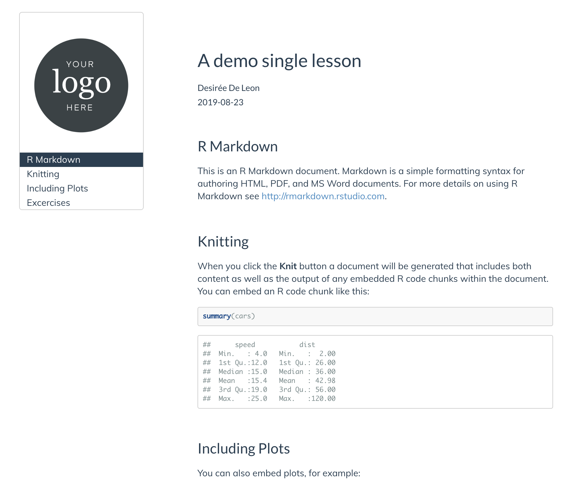
We’ll add a logo above our table of contents. The main way we’re going to do this is by inserting a blank box above our TOC, and then giving the blank container a background image (our logo). We can control how big our logo will be by controlling the size of the box. Here’s what it will look like (if you’re bothered by the outline around it all, don’t worry–we’ll get rid of that in the TOC section):
- Add your logo image to your project directory.
Paste the CSS style rule below. We’ll break it down in a second.
/*----------LOGO above TOC---------*/ #TOC::before { content: ""; display: block; height: 200px; margin: 20px 20px 40px 20px; background-image: url("logo-black.png"); background-size: contain; background-position: center center; background-repeat: no-repeat; }- This uses the selector
#TOCto identify our table of contents. - We use the CSS trick of tacking on a
::beforeto say, “hey, we want you to insert whatever is in this style rule right before our#TOC.” This trick is called using a “pseudo-element” in CSS. - In this case, our pseudo-element is a blank box–that’s why it says
content: "";. There’s nothing in there. But–we do give our blank box some dimension with theheight:property. - The blank box is no longer blank when we use our logo as its background image.
- This uses the selector
- Change the image url to use your own image.
Knit and check out the results. If you need to adjust the size of your logo, you can fiddle with the
height:property in the CSS above.
10.6.3.1 A second logo option
If you chose not to use a floating table of contents, then adding a logo the way we have above won’t work since there won’t be a #TOC that a logo can go ahead of. So, you can instead place your logo in upper righthand corner, in line with the Title and Author.
- Add your logo image to your project directory.
- Open
style.css. Paste this CSS rule into your CSS file:
- Edit the image url to be your own image file path.
Save your changes and knit your
.Rmdlesson to see your logo. You can fiddle with theheight:property to adjust the logo size.
10.6.3.2 A third logo option
But wait–there’s more! Here is a third option for adding a logo if you want it in the upper righthand corner, above the Title and Author fields. We personally like this one the least (asethetically, but also because it’s more involved to implement), but sometimes you might need to do this if your Title and content keep running into the logo with option 2.
To do this, you will need three things:
- A different CSS style rule
- An HTML file with one line of code
- To edit your YAML so you can reference the HTML file
10.6.3.2.1 Create an HTML container
We need something that we can put our logo into– like an empty container. This is where the HTML file comes in. This file creates an empty tag inside of it, but we’ll give the empty tag a name, “upper-right-logo”, so that we can fill it up with our logo later using CSS. Let’s make the HTML file:
- From the IDE, you’ll create a new HTML file by going to File > New File > Text File.
Paste the line of code below into the HTML file.
<div class="upper-right-logo"> </div>Save this file as
logo-option.html. You can choose a different name if you want.
10.6.3.2.2 Link the HTML file to your YAML
Now we have a containter (via our HTML file), but R Markdown needs to know where to put it with respect to our page. That’s where the YAML comes in. We can tell our YAML that we want whatever it finds in this HTML file to be included as the first thing on of our page. We do this by using the includes: before_body option:
- Open your
.Rmdfile. Add the
includes:andbefore_body:lines.- Edit the filename to be your HTML file if you chose a different file name.
Save your changes.
10.6.3.2.3 Fill the container with your logo
Finally, the CSS is where we’ll say “take the empty container we created in the HTML file, and make sure it’s yay tall and that it has this logo image as its background, etc.”
Here’s how that goes down:
- Add your logo image to your project directory.
- Open
style.css. Paste this CSS rule into your CSS file:
- Edit the image url to be your own image file path.
Save your changes and knit your
.Rmdlesson to see your logo. You can fiddle with theheight:property to adjust the logo size.
I won’t use this logo option in the demo lesson as we move on to the next steps, but now you know how to do it if you need it.
10.6.4 White Space
If you added white space manually in the 6.5 section, you can remove that now, and we’ll add some in programatically with our CSS.
- First up is adding space above and below the title with the the
margin-top:andmargin-bottom:properties.- The unit
emhere is equal to whatever you have your font-size set to. This is nice because it means your white space will scale even if you change your font size.
/*----------------ADDING WHITE SPACE-------------*/

.title {
  margin-top: 2.75em !important;
  margin-bottom: 0.75em;
}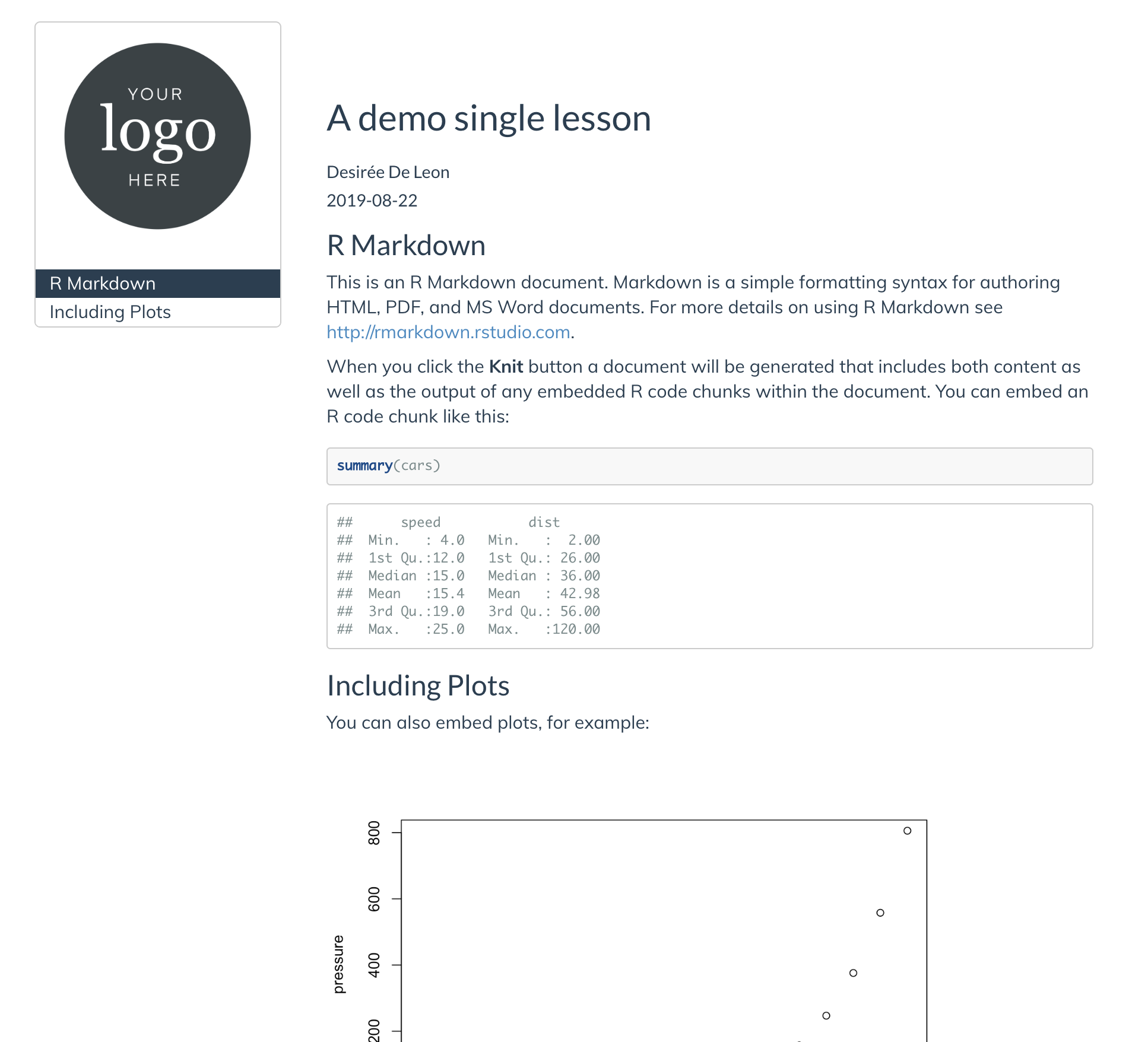
- The unit
But this leaves our logo squished up at the top of our page–so let’s adjust our earlier style rule that we used for our logo, by increase the logo’s top
marginto2.75emalso. When a margin has four numbers, the first value applies to the top./*----------LOGO above TOC---------*/ #TOC::before { content: ""; display: block; height: 200px; margin: 2.75em 20px 40px 20px; background-image: url("logo-black.png"); background-size: contain; background-position: center center; background-repeat: no-repeat; }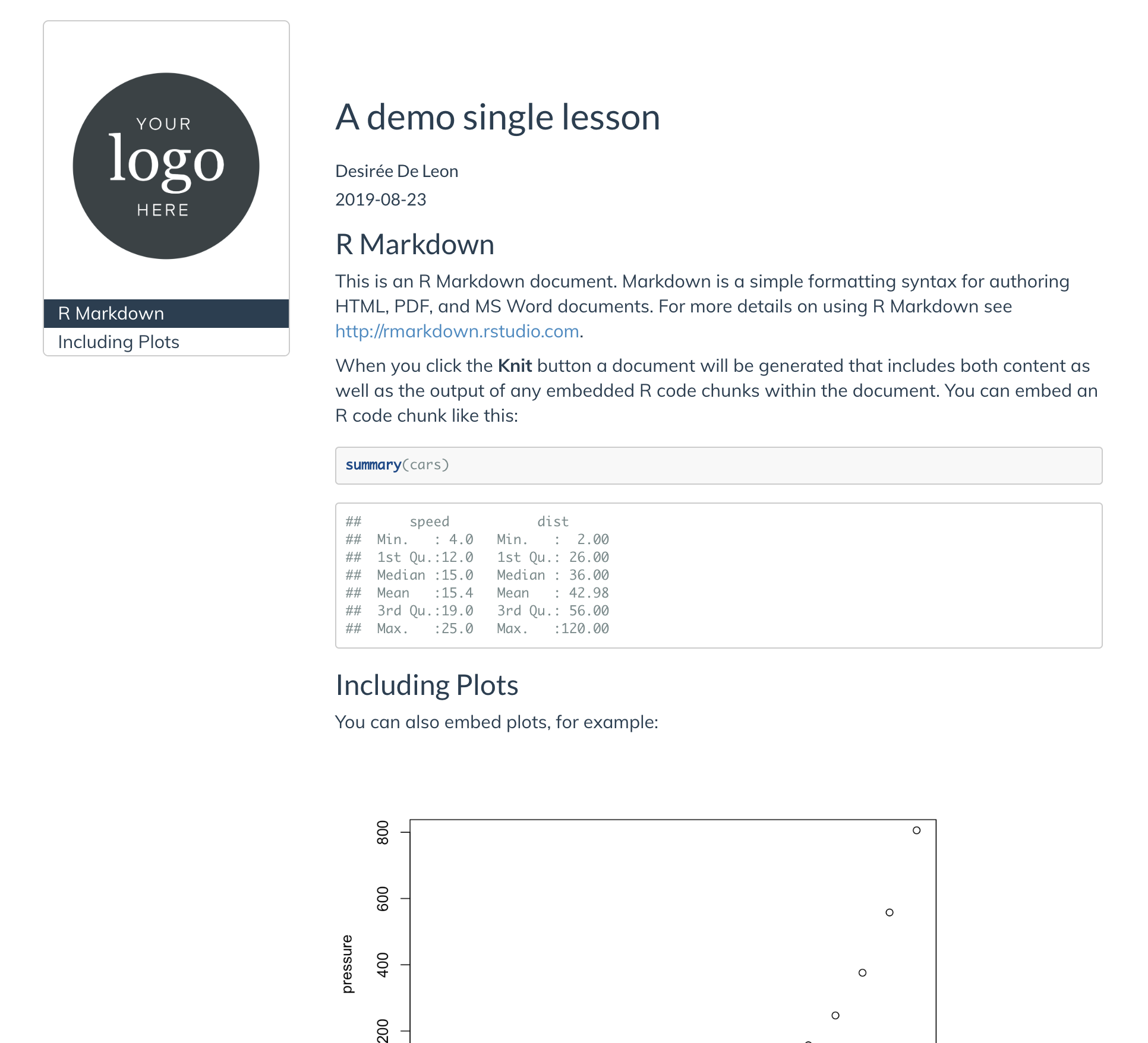
Let’s add white space in between our other headers. We want there to be a little more white space above our highest level headers (h1) than above our headers lower in the hierarchy (so that sections are more clearly delineated), so we’ll style the h1 headers separately from the other headers.
.section h1 { margin-top: 2.5em !important; margin-bottom: 0.75em; } .section h2, .section h3, .section h4, .section h5 { padding-top: 1.5em !important; margin-bottom: 0.75em; }- The selector
.section h1,.section h2, etc. selects only headers within a section (in other words, this excludes the title and subtitle, which are also technically h1 and h2 headers–but which don’t exist inside the “section” content of the page.)
- The selector
We added white space in between our headers, but we can also add space in between the TOC and the body content, which right now is so squished together. Let’s increase the space–but only when the screen is wide enough to allow it. For this, we’ll have to use our first media-query.
A media query is like an additional outer rule that says, “hey, only apply the CSS rule inside if [insert condition about screen width here] is met”. Media queries are useful for styling something different on a big screen than you would on mobile, etc.
In the case below, we only increase the space between the TOC and the body content if your user’s browser screen is at least
992pxwide:
Lastly, you may have noticed that there’s a lot of excess empty white space at the end of the lesson, which can lead to a lot of unnecessary scrolling. Let’s get rid of ost of that space with this addition to our CSS:
10.7 Table of contents (TOC)
Now it’s time to style the table of contents. Right now my demo .Rmd only has two section headers, so I’ll add two more headers so that it’s easier to demonstrate the changes I’m making to the TOC. Here’s where I’m starting:
First we will get rid of the TOC border and make the font size a little smaller:
/*------------Table of Contents (TOC)----------- */


.tocify {
  border: none;   /*Removes border */
  border-radius: 0px; /* Gets rid of rounded corners on TOC */
  font-size: 16px;
}
- Next, we increase the space between each of the TOC items with the
line-height:property, for some gratuitous breathing room. We also add a solid grey line as a border, as a subtle divider between the TOC and the rest of the page.
.tocify ul, .tocify li { /* Increases spacing between TOC headers*/
    line-height: 25px !important;
}

.tocify ul {
  border-right: solid 1px #eee; /* Thin right border on TOC list */
}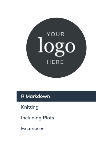
- Now we remove the dark-blue background for the TOC links that you see when a link is active or when you hover over it. We do this using the
background-color:property and setting it to white with#ffffff. We also change the color of the active and hovered links to be a little lighter (
#787878) than the base color./* Active TOC links*/ .list-group-item.active, .list-group-item.active:hover{ color: #787878; background-color: #ffffff; border-color: #ccc; } /* Hovered TOC links*/ .list-group-item:hover { color: #787878; background-color: #ffffff; border: none; }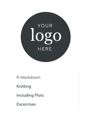
10.8 Questions counter
Finally, if you plan on using questions for learners in your doc (for example, for homework problems), you might want to make it easier to see these questions by styling them. Like this:
This idea and CSS was inspired by Maria Tackett’s STA210 course: https://github.com/STA210-Sp19/website
The CSS you need is this–it’s a lot, but for most use-cases the only style rule you really need to worry about editing is the second-to-last one, with the content: and color: properties:
  /* -----------Question counter ---------*/

  body {
    counter-reset: li;
  }

  .question ol {
    /* Remove the default left padding */
    padding-left: 0;
  }

  .question ol>li {
    /* Create a positioning context */
    position: relative;
    /* Disable the normal item numbering */
    list-style: none;
    width: 90%;
    padding-top: 10px;
    padding-bottom: 10px;
    padding-right: 0;
    padding-left: 120px;
  }

  .question ol>li:before,
  .question ol>p>li:before{
    /* Use the counter as content */
    content: "Question " counter(li) ": ";
    /* Increment the counter by 1 */
    counter-increment: li;
    position: absolute;
    color: #5ebccf;
    left: -0.5px;
    font-weight: bold;
  }

  .question ol ol {
    counter-reset: subitem;
}- If you want to change the styling to say something other than “Question”, then you modify
content: "Question ". - You can change the color of the called out question, too, with the
color: #5ebccf;
How to use the question counter:
In your .Rmd, you have to enclose your numbered list items that you want to be styled questions with special div tags:
<div class="question">`

1. My first question
1. My second question

</div>`